It is time for me to share a little more of our home. As you may know, in 2019, we got the keys to our first home. It has been a very long renovation journey. Even though the house was a 13-year-old new build, there was still hell of a lot to do. Granted, we didn’t have the likes of rewiring to do that older houses need.
However, some of the issues that we have found with this more modern house really do outweigh some of the older issues. That is a topic for another day. This is a post all about our lounge decor. For me, this is the most important room of the house. There was a fine line between making it look immaculate and it being snuggly and comfy. Anyway, this is all about our lounge decor.
Our additional chimney breast.
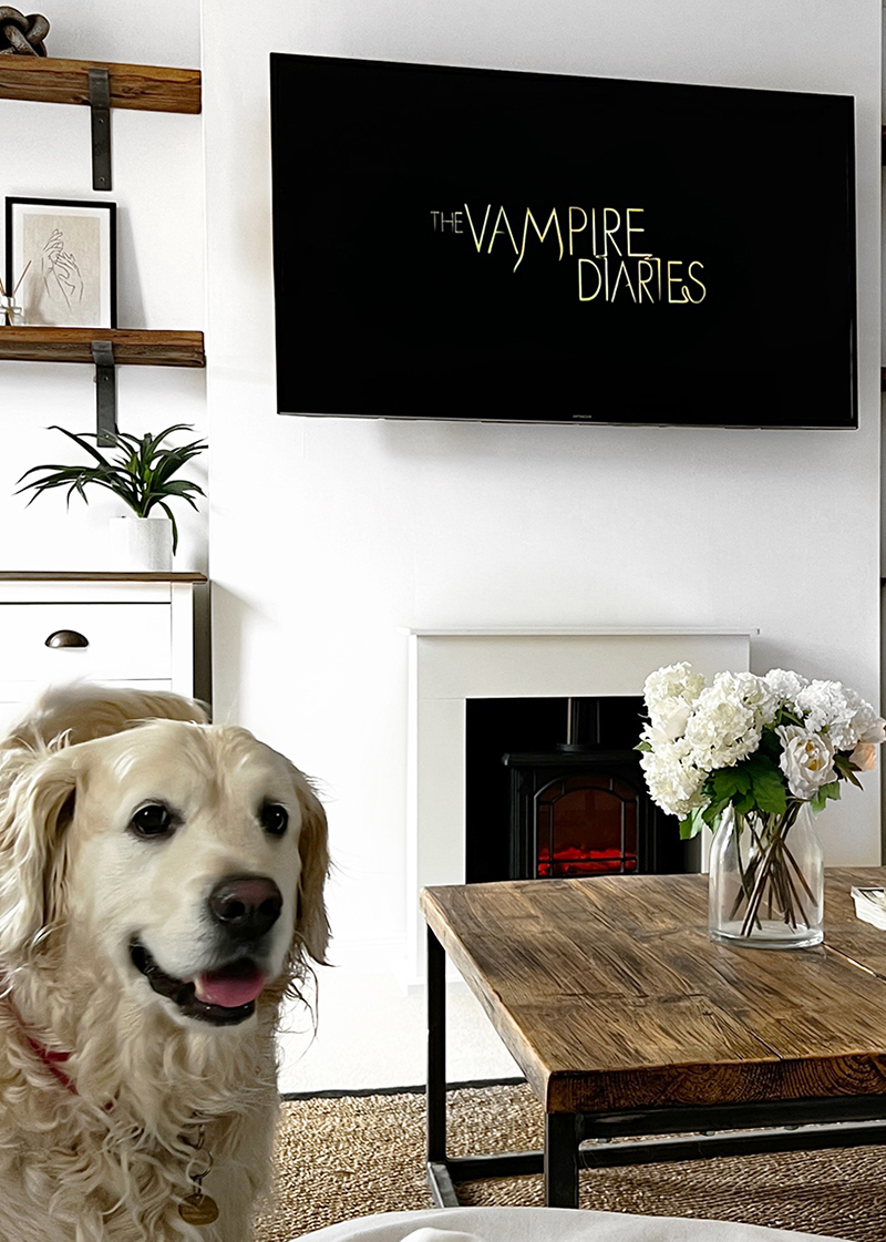
The issue with many new builds is that they lack feature. This lounge space was incredibly large and all of the walls were fairly plain. One thing that I knew I wanted was a false chimney breast adding. We did this ourselves one weekend out of stud timbers and plasterboards. It all came together flawlessly and it just helps to give our space a focal point. I think that it is fairly obvious to people that this is false, as we just have a push to the fireplace, but it still adds a big feature to the space. We adore how it looks and are so glad that we put in the hard work and put this together!
Styled shelf décor.
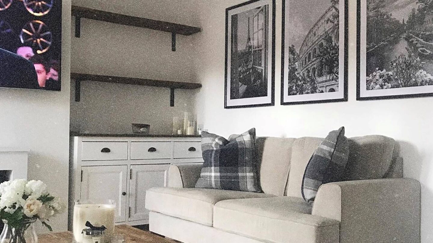
Either side of the false chimney breast, I knew that I wanted cupboards and chunky wooden shelves. I don’t think that it could have turned out any better. For me, the biggest challenge with this area was getting the styling right. The truth is, the four shelves that we have are huge. I wanted a mix of plants, frames, candles, books and other small trinkets. As I mentioned, we have been in this house now for 2 years and I still think that there is work to be done with these shelves and more things to be added. I really do think that I am going to be playing around with these shelves until we leave this house in years to come!
Rustic coffee table and rug.
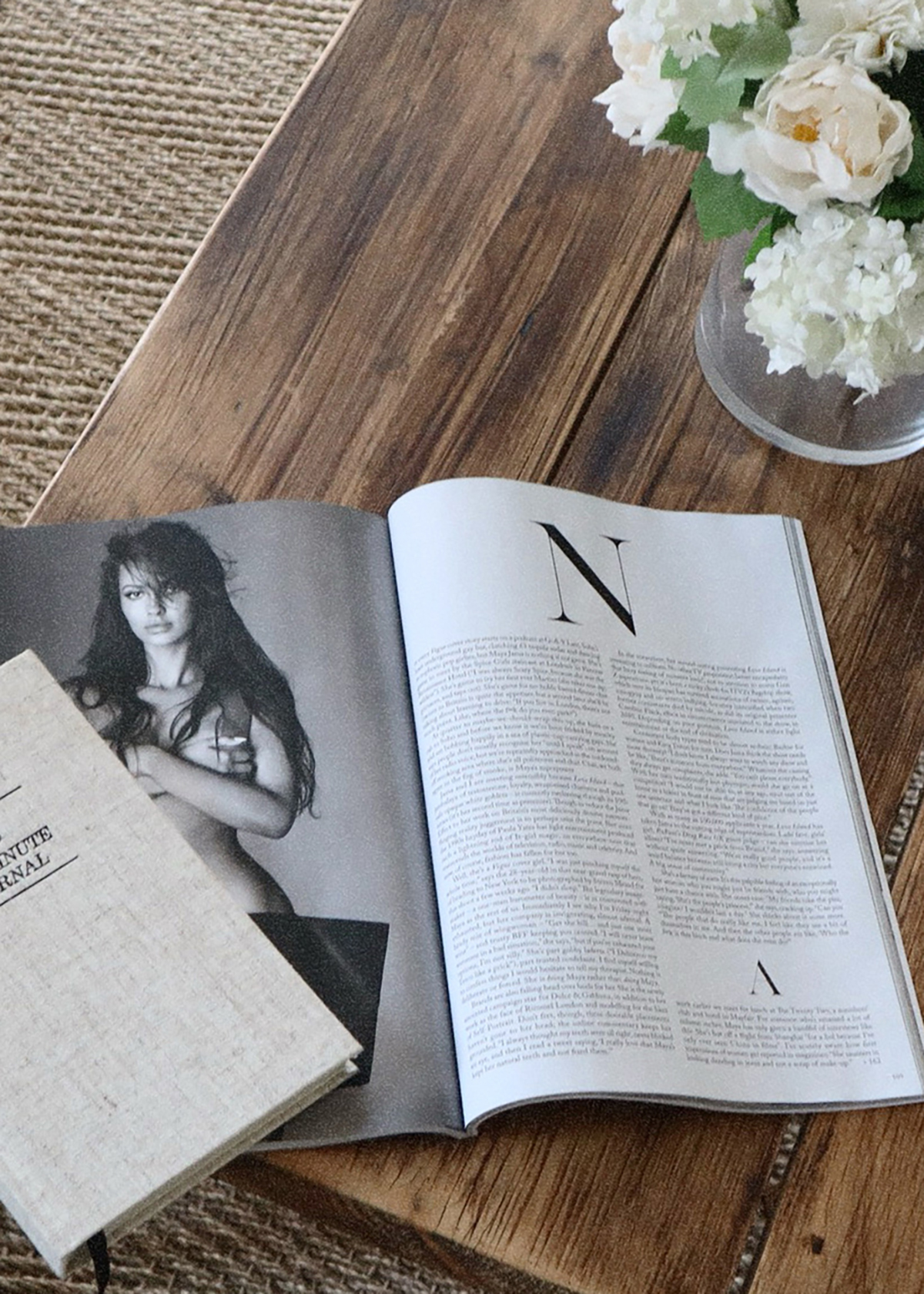
As soon as I saw this lounge space, I knew that I wanted a big coffee table. You need to remember; we came from a tiny house before we moved in here. We didn’t have space to throw a cat, never mind have a huge wooden coffee table in the middle of the room. As soon as I saw this piece, I envisaged it, sat on top of a jute rug, with crisp white flowers. As you walk through the door, this is where your eyes are drawn and I adore that. It is a great table and the styling on top is sheer perfec.t Plus, because of the stacked Vogue magazines, I can change up the look when a new edition comes out. Even my husband loves that about it!
Side tables with rustic touches.
At the side of two of our sofas, we have side tables. As much as I didn’t really want these because I could think of other things to do, they were needed. The space really needed something that was practical for drinks and lighting. The sideboards themselves were from Next, the lamps were from Hudson Home and then other little touches were from everywhere else. I love that again; these tables bring in the rustic elements. The chunky wood helps to bring in the coffee table, shelves and other features throughout the house. We always get little comments about how great these look whenever we have visitors!
Panelling and wallpaper.
One of the spaces that I really did struggle with in this space was the vastness of the widest wall. This is the wall that is behind the main three seater sofa. It is just that much of a wide and very blank wall, nothing seemed big enough for the space. In the end, the simplest thing to do was to add some panelling and then wallpaper. I opted for a style of panelling that is not in any other room. I think that it is super simple, yet brings enough to the space. Not to mention that it was easy enough for me to fit myself. Then, for the wallpaper I must have got 50 samples from John Lewis before finally settling on this pattern. It ties all of the rustic elements in and I adore how it looks.
Sideboard and images.
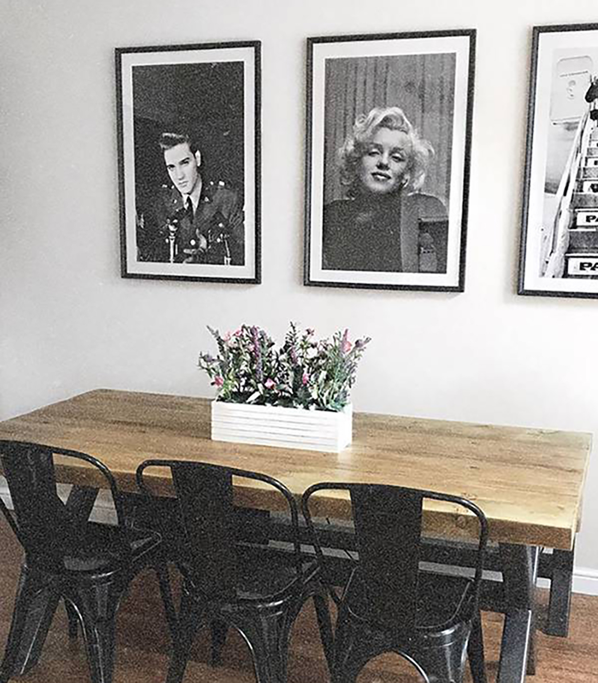
The last little area what I want to mention is a sideboard that we have. Behind the door to our lounge, we have a large space. For a long time, it was very blank and we didn’t know what to do with it. Then, with the help of good old Pinterest, I found inspiration for this space. I wanted a space that looked like it was just threw together, but we all know that it wasn’t. The sideboard is from the Cotswold Company. The frames were from a private seller on Etsy. Candles and other bits are mainly from the Selfridges website. It just all comes together to look really neat and I adore it. It fills the space and also looks incredibly chic!
I hope that you guys liked this blog post and seeing our lounge decor. I have truly loved creating this space. Whenever I want some time to myself, this is the area that I come. If we have guests over, this is where we sit. It is a space that is comfortable, yet has our interior design perfectly nailed. We even get friends of ours come around and take photos to inspire their own home.
I don’t think that there is any greater compliment than that. I cannot wait to keep adding small touches to this space and really adding in the features that makes it a home. As always, I would love to hear from you guys. Please do leave me a comment below. Let me know what you think of our lounge decor. If you would do anything different. Also, I would love to hear about your homes!
